Instrumentation: The First Four Things You Measure

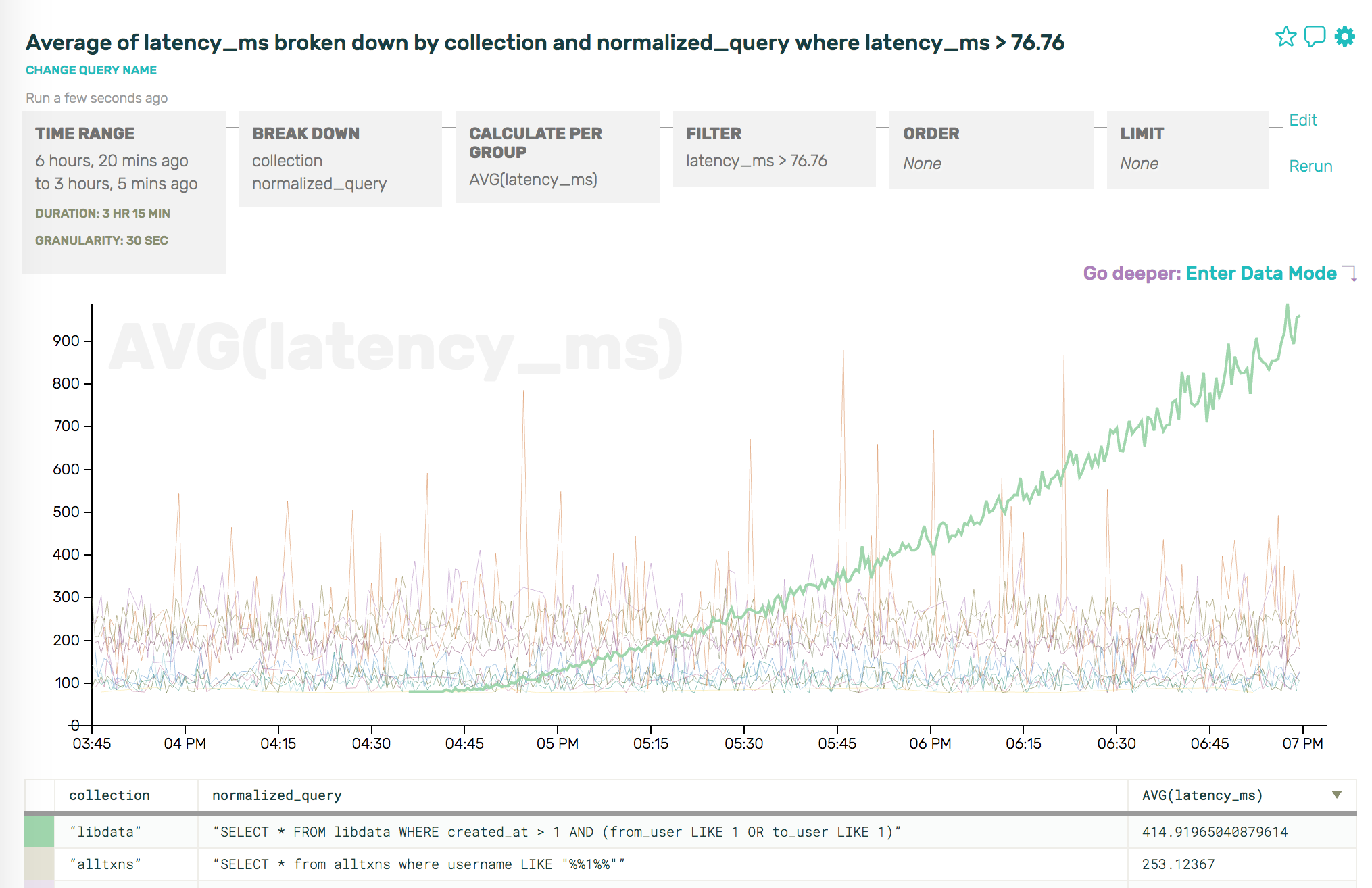
Note: this is the first in a series of guest posts about best practices and stories around instrumentation. Like it? Check out the other posts in this series. Ping Julia or Charity with feedback!

This is the very basic outline of instrumentation for services. The idea is to be able to quickly identify which components are affected and/or responsible for All The Things Being Broken. The purpose isn’t to shift blame, it’s just to have all the information you need to see who’s involved and what’s probably happening in the outage.

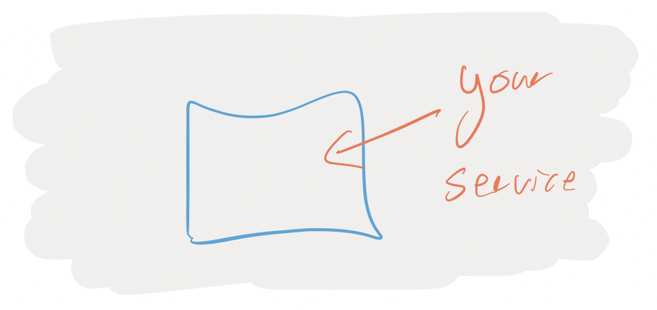
In a total abstract void, you have a service.

service

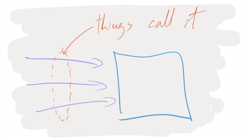
Things are calling your service, be it browsers from the interweb, or other services, or API clients from the interwebs: upstream things are depending on you.

things calling your service

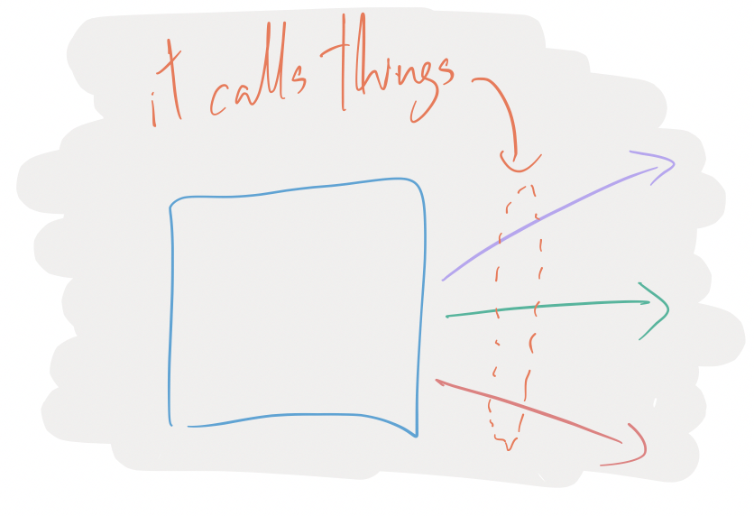
Most of the time, your service will have dependencies on other downstream things: some database or other service.

dependencies

And when there’s problems happening, people from Upstreamland will be telling you about your broken service, and you’ll, maybe, turn around and blame people in Downstreamistan:

complaining

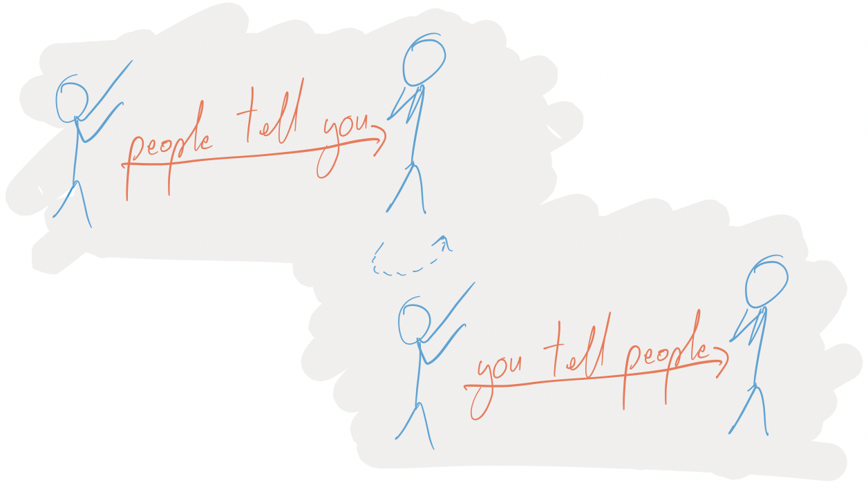
But somehow, you need to be able to know when something is your service’s fault, or someone downstream’s fault. To do that, when people tell you that your service is broken, you need to be able to see if internally, it appears to be broken.

investigating

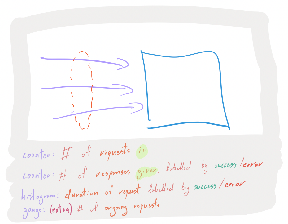
For all incoming requests, you want to have the following instrumentation points:

  • A counter that is incremented for each request that you start serving.
  • A counter that is incremented for each request that you finished serving, aka responses, labelled by successes or errors.
  • A histogram of the duration it took to serve a response to a request, also labelled by successes or errors.
  • If you feel like it, throw in a gauge that represents the number of ongoing requests (helps identify leaks, deadlocks and other things that prevent progress).

With this information, when people tell you that your service is broken, you can prove or disprove their claims:

  • Yup, I can see the problem:
    • my thing is returning lots of errors, very rapidly.
    • my thing is returning few successes, very slowly.
    • my thing has been accumulating ongoing requests but hasn’t yet answered them.
  • Nope, problem is before me because my thing hasn’t been receiving any request.

This gives you many dimensions to prove or disprove hypothesis about what’s happening.

If it seems like your service is involved in the problem, the next step is to know: is it strictly my fault, or is it a problem with my downstreams? Before you turn around to other people to tell them their things seem to be broken, you need numbers:

need numbers

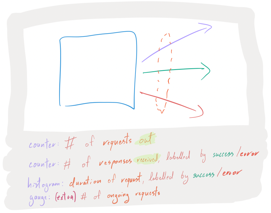
For all outgoing requests (database queries, RPC calls, etc…), you want to have the following instrumentation points:

  • A counter that is incremented for each request that you initiate.
  • A counter that is incremented for each request that had a responses, labelled by successes or errors.
  • A histogram of the duration it took to get response to a request, also labelled by successes or errors.
  • Again, maybe throw in a gauge that represents the number of ongoing requests (helps identify stuck calls, or build ups of thundering-herds-to-be).

And now, you can see quickly whether the reported problem lies within your service or within one of its dependencies.

I talked about services, databases, API clients, the browsers on the interwebs… this principle is valid for any individual piece of software that’s in some sort of client-server shape, be it:

basic www to service to db

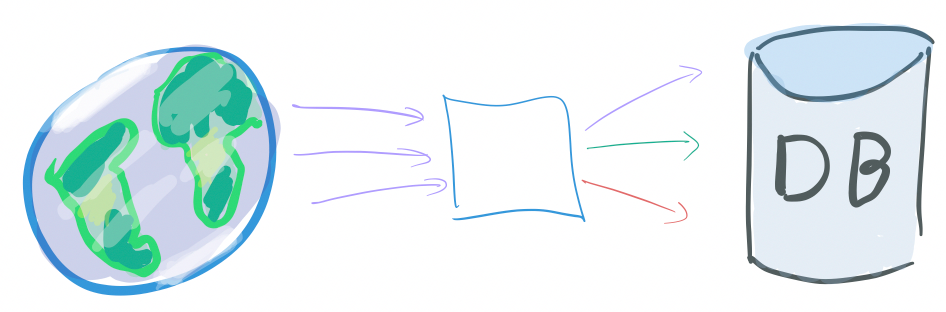
a monolithic Rails application with a SQL DB, some Redis and what not… that’s alone serving requests from the webs, or:

www to service to many dbs and backends

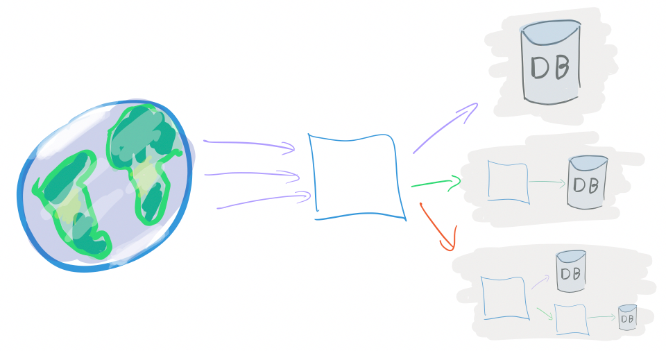
An organically, loosely organized set of DBs and web services, or:

lots of interlinked backends

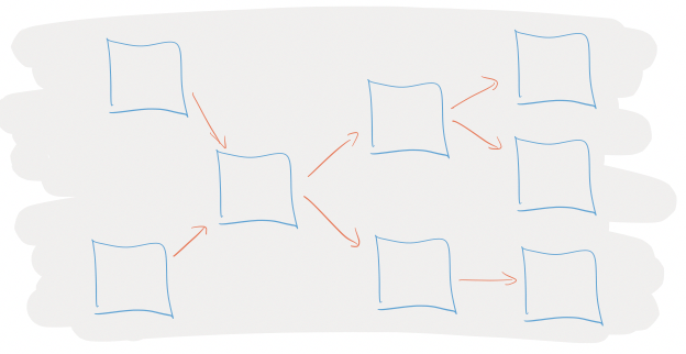
A massively distributed microservice soup.

In Instrumentation 102, we will see how to instrument the internals of a service. Due to budget constraints, Instrumentation 102 has been indeterminately postponed.

Thanks again to Antoine Grondin for their contribution to this instrumentation series!

Instrumentation: A Series

Good morning! Over the next couple of weeks we are going to be hosting a series of posts here on instrumentation.

It started, as most trouble does, on Twitter.

In the ginormous thread that followed, we heard a little bit of everything: joy and angst, love professed for debuggers and helpful links for tooling. Famous programmers admitted out loud that they still didn’t know how to instrument code. And more than a few people begged: please write about this!

But I want to learn more about instrumentation too! So I grabbed my friend Julia Evans, who is the best at asking questions, and we decided to ask a bunch of questions together.

For the next two or three weeks we will be publishing roughly one piece per day on instrumentation. We have awesome people writing on everything from databases to networking, distributed systems to Linux internals. I’m SO excited.

Our first piece will be by Antoine Grondin, and it will start with the basics: is your service broken or not? He explains a super useful set of basic metrics you can use to find out!

See you tomorrow! ~ Charity and Julia

The Problem with Pre-aggregated Metrics: Part 3, the "metrics"

This is the third of three posts focusing on the limitations of pre-aggregated metrics. The first one explained how, by pre-aggregating, you’re tightly constrained when trying to explore data or debug problems; the second one discussed how implementation and storage constraints further limit what you can do with rollups and time series.

Finally, we arrive at discussing “metrics.” Terminology in the data and monitoring space is incredibly overloaded, so for our purposes, “metrics” means: a single measurement, used to track and assess something over a period of time.

While simple to reason about (“this number is the overall error rate for my API”), the problem with metrics is just that—they’re individual, they’re isolated, they’re standalone dots in the big picture of your system. And looking at the progress of standalone datapoints over time means that, while you can get a sketch of reality over that time, you’re never really able to reconstruct reality to identify what really happened. (See Part 1: asking new questions)

This part-3-of-3 problem is the most subtle to explain of the bunch, so let’s work with some of our trusty examples. Using our datastore example from Part 1, let’s imagine that we’re tracking metrics across two main axes, the operation type (e.g. reads, increments, updates, etc) and namespace (this example will use “libdata”, “libmeta”, and “alltxns”):

statsd.timing(`db.op.${operation_type}.latency`)
statsd.timing(`db.ns.${namespace}.latency`)
statsd.timing(`db.op.${operation_type}.ns.${namespace}.latency`)`

(Note that statsd.timing captures percentiles, average (mean), stddev, sum, and lower/upper bounds for us.)

Well, but what if there’s some third attribute that really makes our datastore fall over? We could have just known ahead of time to store something like (db.op.${operation_type}.ns.${namespace}.q.${normalized_query}.latency)… but we already know from Part 1 that it’s a pain to have to anticipate problems ahead of time and manage all those separate metrics, and we know from Part 2 that there are practical limits to how many cross products we should store.

But real-life systems often do have lots of different things going on! Some attributes are highly likely to be worth partitioning by (e.g. hostname), while others might seem less immediately useful but are readily available and might come in handy someday (e.g. AWS instance type, availability zone, build version).

So—instead of carefully pruning which metrics to track and wasting time evaluating how important certain cross products are, sometimes it’s just easier to track a handful of available attributes, then just peek at a few representative events to see the relationships laid plain for us.

In other words, rather than having to look at a bunch of disparate graphs and try to line up anomalies:

Graphing a bunch of different metrics next to each other

and trying to visually correlate trends (presumably increments on alltxns are correlated with an increase in latency, above), sometimes it’s just straight-up easier to look at some anomaly by saying, “Show me the events that’re causing the latency go so much higher above the average”:

Somehow isolating events that contribute to the increase in an AVG() stat

Metrics, once captured, mean that this sort of question is impossible to answer. You can’t go back and reconstruct reality from rollups; you can’t ask for just the events that caused the average latency to increase. With Honeycomb, though, you can iterate like this pretty trivially:

Going from an overall AVG(latency_ms) to a P95(latency_ms) where latency_ms > the previous AVG, broken down by op
(On the left, we look at overall latency to get a sense of what our datastore is doing; On the right, we take that information—the average latency is 98.1135ms -- toss it into a 'latency_ms > 98.1135' filter, and use P95 because we're more interested in the outliers.)

Or, if you like, now that you’ve defined a filter like latency_ms > 76.76, you can drop down and see the raw events and the relationships they contain.

Obligatory Data Mode shot
Boy, that particular type of read on libdata sure looks nasty

Looking at these, we now have a much better idea of patterns like “we only ever perform increments on libmeta (boring!), but alltxns receives updates, increments, and reads”—more directly and easily than staring at reality through the very small, narrow lenses of individual metrics over time.

With so many things in motion, sometimes just seeing how various attributes are related to each other is more valuable than having to infer it from graphs.

And, ultimately, because we’re visual creatures, Honeycomb makes it easy to pop back from data mode into visual mode, and ask just the right question to confirm our hunch:

The right combination of attributes to find reality with Honeycomb

Note: it’s true, detractors will absolutely be able to construct scenarios in which the visually-correlating-trends approach is enough, but that approach relies so heavily on things going wrong in predictable ways or clues in low-cardinality fields that we remain highly skeptical.

Want more? Give us a try!

For more illustrated examples of using Honeycomb to explore database data, check out our other database posts—or just sign up and get started today!

The Very Long And Exhaustive Guide To Getting Events Into Honeycomb No Matter How Big Or Small, In Any Language Or From Any Log File

How do you get events in to Honeycomb? This gets confusing for lots of people. Especially when you look at all the gobs of documentation and don’t know where to start. But all you need are these three easy steps:

  1. Form JSON blob. Go nuts! Smush as many keys and values as you want into one fat request. This is your “event”.
  2. Send blob to Honeycomb API. curl will do fine, or use one of our handy SDKs, or honeytail your logfiles in.
  3. Profit. Remember, if you don’t charge for your business you aren’t a sustainable enterprise. Okay, that’s just general good advice.

That’s it. All the fancy docs, the libraries, all the code we’ve written for tailers and parsers and forking inputs? Just helper functions. They help with all that string parsing of logs and polling of applications that aren’t friendly to instrumentation, like databases. For your own code, it’s much easier to skip the logfile step and just ship events from your application.

It really is that simple. Structure, ship … profit. Give us a try!