Finite state machines make instrumentation easy

This is the third in a series of guest posts about instrumentation. Like it? Check out the other posts in this series. Ping Julia or Charity with feedback!

There is a way to structure programs that makes inclusion of instrumentation straightforward and automatic, and it’s one that every hardware and software engineer should be completely familiar with: finite state machines. You have seen them time and again as illustration of how a system works:

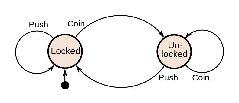
What makes FSM instrumentation straightforward is that the place to expose information is obvious: along the edges, when the state of the system is changing. What makes it automatic is that some generic actor is usually driving a host of specific FSMs. You only need to instrument the actor (“entering state Q with message P”, “leaving state S with result R”), and every FSM it runs will be instrumented for free.

I learned how easy FSMs are to instrument while working on Webmachine, the webserver that is known for implementing the “HTTP Flowchart”. (click for the full flowchart)

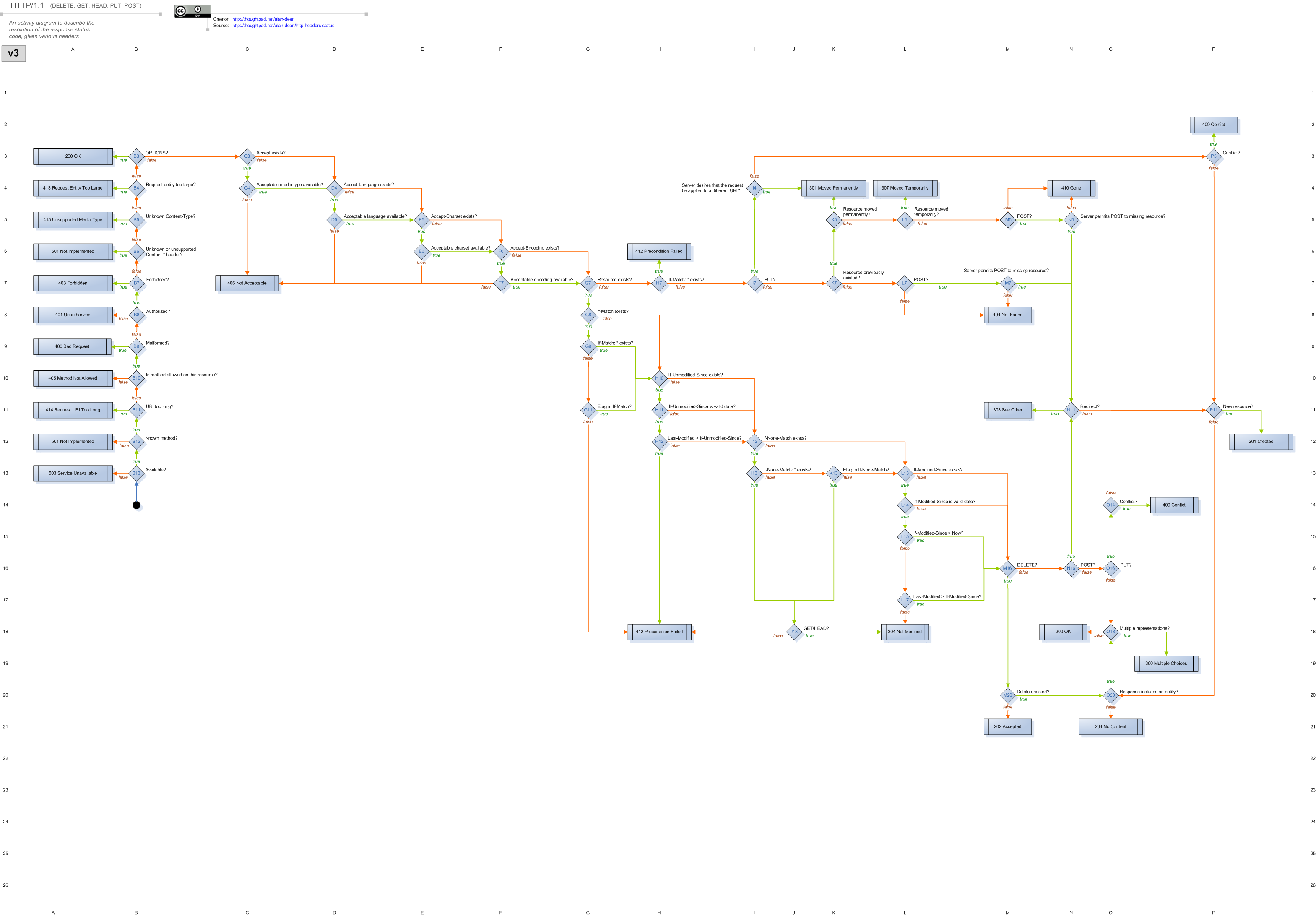
Each Webmachine resource (a module handling a request) is composed of a set of decision functions. The functions are named for the points in the flowchart where decisions have to be made about which branch to follow. This is just alternate terminology, though: the flowchart and resource describe an FSM, in which the decision points (and terminals) are states.

Driving the execution of a Webmachine resource is a module called webmachine_decision_core. This is where the logic lives for which function to call, and which branch to take based on the result. It triggers each function evaluation by calling a generic webmachine_resource:resource_call function, with the name of the decision.

resource_call(F, ReqData,
              #wm_resource{
                 module=R_Mod,
                 modstate=R_ModState,
                 trace=R_Trace
                }) ->
    case R_Trace of
        false -> nop;
        _ -> log_call(R_Trace, attempt, R_Mod, F, [ReqData, R_ModState])
    end,
    Result = try
        apply(R_Mod, F, [ReqData, R_ModState])
    catch C:R ->
            Reason = {C, R, trim_trace(erlang:get_stacktrace())},
            {{error, Reason}, ReqData, R_ModState}
    end,
        case R_Trace of
        false -> nop;
        _ -> log_call(R_Trace, result, R_Mod, F, Result)
    end,
    Result.

This is where the ease of instrumenting an FSM is obvious. The entirety of the hooks needed to support tracing and visual debugging of every Webmachine resource are those two log_call lines. They record the entrance and exit of each state of the FSM without requiring any code to complicate the implementation of the resource module itself. For example, a simple resource:

-module(blogapp_resource).
-export([
    init/1,
    content_types_provided/2,
    to_html/2
]).

-include_lib("webmachine/include/webmachine.hrl").

init([]) ->
    {{trace, "/tmp"}, undefined}.

content_types_provided(ReqData, State) ->
    {[{"text/html", to_html}], ReqData, State}.

to_html(ReqData, State) ->
    {"<html><body>Hello, new world</body></html>", ReqData, State}.

This resource does no logging of its own (as you can see), but for each request it receives, a file is created in /tmp that can be rendered with the Webmachine visual debugger. For example, the processing for a request that specifies Accept: text/html looks like this (live example):

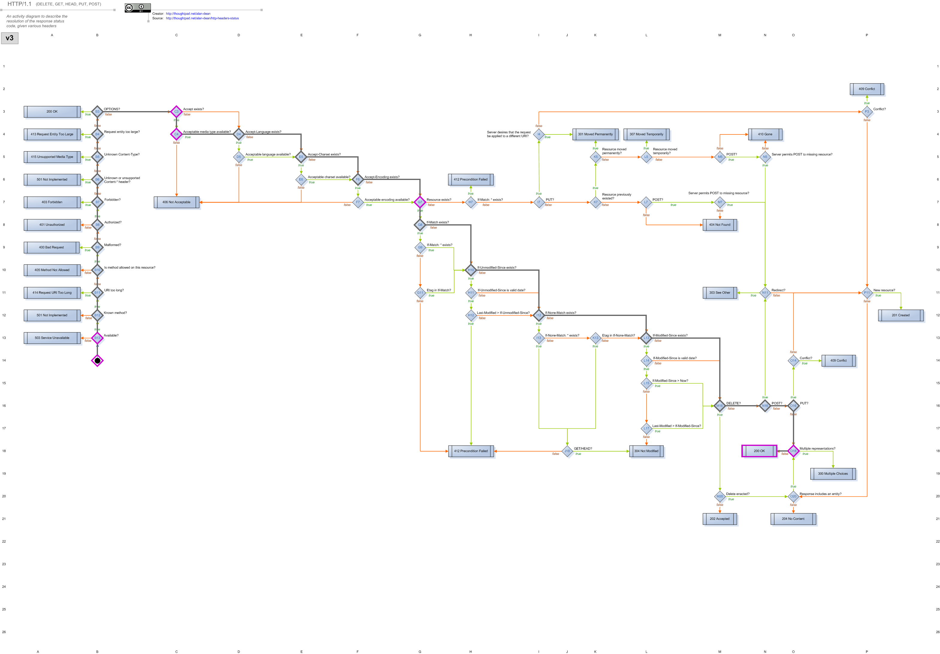
It’s easy to see that the request made it all the way to the 200 OK result at grid location N18. Along the way, it passed through many decisions where the default behavior was chosen (grey-outlined diamonds), and a few where the resource’s own implementation was called (purple-outlined diamonds). Clicking on any decision will display more information about what happened there.

In contrast, the processing for a request that specifies Accept: application/json looks like this (live example):

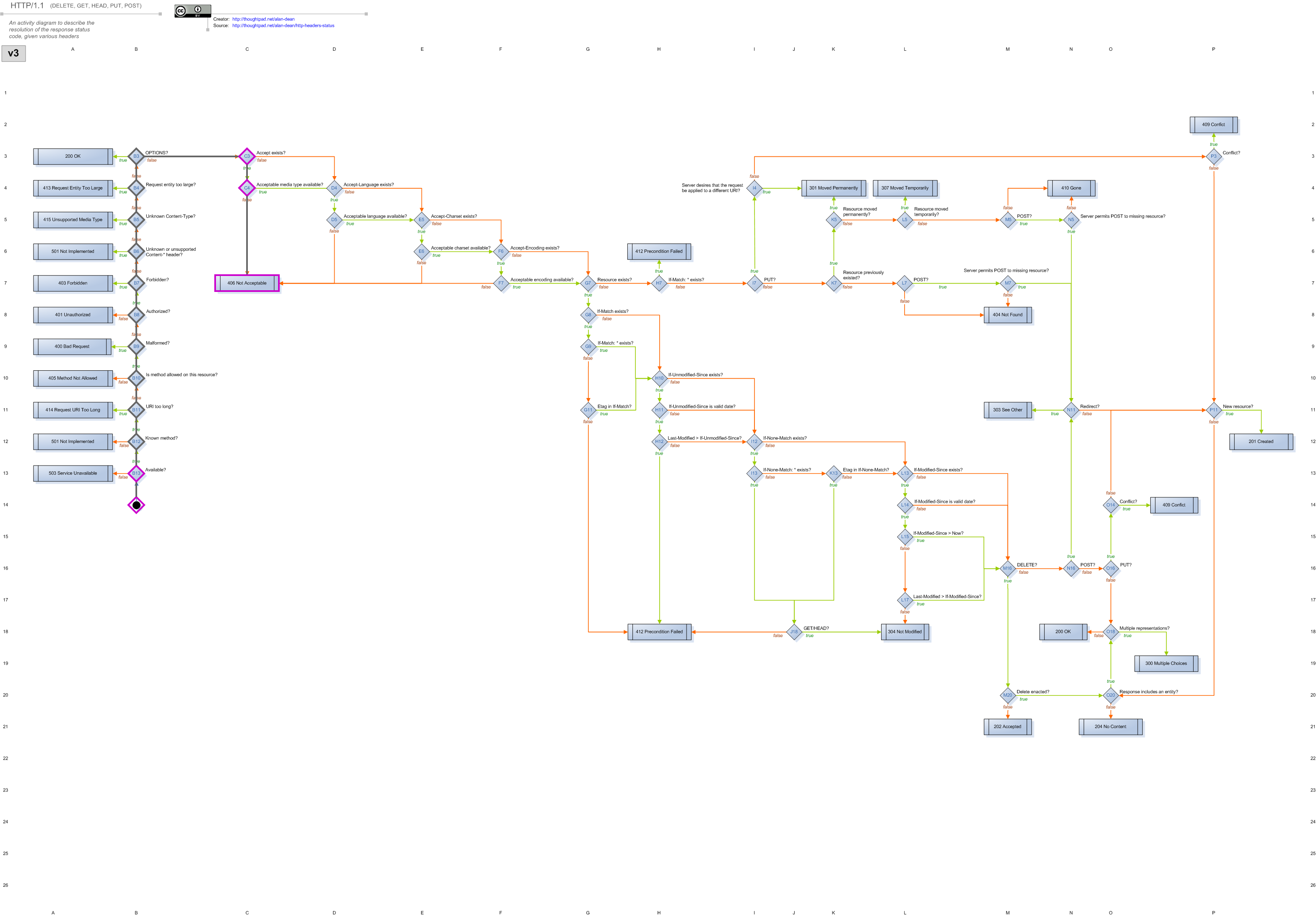
Now it’s easy to see that the request stopped at the 406 Not Acceptable result at grid location C7 instead. For no more code than specifying where to put the log output, we’ve gotten the complete story of how each request was handled. In case you prefer the original text to this visual styling, I’ve also archived the raw trace files.

This sort of regular, simple instrumentation may seem naive, but the regularity and simplicity offer some benefits. For example, all of the instrumentation points have obvious names: they are the same as the states of the FSM. This alone continues to help beginners bootstrap their understanding of Webmachine. When they’re confused about why something happened, they can go straight to the trace or debugger, and either search for the name of the decision they expected to turn differently, or find the name of the decision that did go differently, and know exactly where to return to in their code. Resource implementors add no code, but get well-labeled tracing for free.

Finite state machines can be found under many other names: flowcharts, chains, pipelines, decision trees, and more. Any staged-processing workflow benefits from a basic “stage X began work W”, “stage X finished work W”, which is completely independent of what the stage is doing, and is equivalent to the stage entering and exiting the “working” state. See Hadoop’s job statistics for an example: generically generated start/stop information that an operator can use to get a basic idea of progress without needing the job implementor to add their own instrumentation. I sometimes even consider the basic request/response logging of multi-service systems as a form of this: sending a request is equivalent to entering a waiting state, etc.

To speak more broadly, the important points to instrument are those when application state is changing. This is how I track down where a process diverged from its expected path, or how long it took to make the change. Finite state machines help by making those points more obvious. Instrumenting state transitions reduces the burden on the implementor, by naturally answering the question of where instrumentation belongs and what it’s called. It also reduces the burden on the user of learning what the implementor decided. Inspection of the system becomes easier because the state transitions are always instrumented, and instrumented in a way that maps directly to the system’s operation.

Thanks again to Bryan Fink for their contribution to this instrumentation series!

Instrumentation: Measuring Capacity Through Utilization

This is the second in a series of guest posts about instrumentation. Like it? Check out yesterday’s piece on the first four things you measure. Ping Julia or Charity with feedback!

One of my favorite concepts when thinking about instrumenting a system to understand its overall performance and capacity is what I call “time utilization”.

By this I mean: If you look at the behavior of a thread over some window of time, what fraction of its time is spent in each “kind” of work that it does?

Let’s make this notion concrete by examining a toy example. Imagine we’re running a job that pulls request events off of a distributed queue, and updates a hit count table in a database:

while True:
  req = queue.pop()
  route = compute_route(req)
  db.execute('''
    UPDATE hitcount WHERE route = ? SET hits=hits + 1
    ''', (route, ))
  req.finish()

How should we instrument this? How can we monitor how it is performing, understand why it’s getting slow if it ever does get too slow, and make an informed capacity planning decisions about how many workers to run?

We’re making several network calls (to our queue and to our database) and doing some local computation (compute_route). A good first instinct is to instrument the network calls, since those are likely the slow parts:

# ...
  with statsd.timer('hitcount.update'):
    db.execute('''
      UPDATE hitcount WHERE route = ? SET hits=hits + 1
      ''', (route, ))
  with statsd.timer('hitcount.finish):
    req.finish()
# ...

With most statsd implementations, this will give you histogram statistics on the latencies of your database call – perhaps it will report the median, p90, p95, and p99.

We can definitely infer some knowledge about this process’s behavior from those statistics; If the p50 on hitcount.update is too high, likely our database is overloaded and we need to do something about that. But how should we interpret a slow p95 or p99? This is a background asynchronous job, so we don’t overly care about the occasional slow job, as long as it keeps up in general. And how do we tell if we’re running near capacity? If it’s making multiple calls, how do we aggregate the histograms into a useful summary?

We can get a much cleaner picture if we realize that we care less about the absolute time spent in each component so much as we care about the fraction of all time spent in each phase of the component’s lifecycle. Is a given worker spending most of its time waiting on the database, or is it spending most of its time idle, waiting for new events?

We can instrument that by counting the total time spent on each operation, and then normalizing to counts-per-second in our stats pipeline, giving us a unitless seconds-per-second ratio. This might look something like this:

@contextmanager
def op(what):
  start = time.time()
  yield
  statsd.increment('hitcount.total_s',
                   value=(time.time() - start),
                   tags=["op:" + what])

while True:
  with op('receive'):
    req = queue.pop()
  with op('compute_route'):
    route = compute_route(req)
  with op('update):
    db.execute('''
      UPDATE hitcount WHERE route = ? SET hits=hits + 1
      ''', (route, ))
  with op('finish'):
    req.finish()

We can now tell our metrics system to construct a stacked graph of this metric, stacked by tags, and normalized to show count-per-second:

service

Since each worker performs one second per second of work, the graph total gives you the number of active workers (and indeed, I generated this example with four workers). We’re losing a bit of time (potentially in the statsd.increment calls themselves?), but we’re pretty close.

We can immediately see that we’re spending most of our time talking to the database – 2.7s/s or (dividing by 4) about 68% of our time. And the stacked graphs give a very clear visualization of the overall usage of the system.

The above image shows a system at running at capacity. If we’re not, then the graph gives us an easy way to eyeball how much spare capacity we have:

service

If we’re at capacity, we will never be waiting on messages, and we should be spending nearly no time in the “receive” state (from the above graph, we know that’s not quite true for this toy system; It’s more true in a heavierweight system, and still a good approximation here). Thus, we can treat all the time in “receive” as spare capacity, since that represents idle time when the workers are waiting for new messages to be available, instead of performing work.

Thanks again to Nelson Elhage for their contribution to this instrumentation series!

Share a Bit More Easily: Public Permalinks on Honeycomb

Knowledge sharing and collaboration (over data, queries, and debugging expertise of all stripes) are near and dear to our hearts—and we’re happy to announce one more small step towards improving this experience!

Until recently, it was possible but annoying to show off an awesome Honeycomb graph: grab the permalink for the graph from the URL bar and paste it anywhere! … But the viewer still had to have a Honeycomb account to view or interact with the data.

shot of the location bar, highlighted

You can now choose to turn on Public Permalinks for your dataset (go to the dataset’s Settings, accessible via the top nav), so that a given query result is viewable by the anyone holding the URL. The query itself won’t be editable, and query history will be omitted from the UI, but the visitor will be able to take a look at the graph and enter Data Mode.

screenshot of a public graph

And, as many have requested, public permalinks unfurl nicely in Slack:

Example Slack unfurl
No inline graphs yet, but we hear you and they're on our list! :)

Give it a shot today (find the “Public Permalinks” checkbox under your dataset’s Settings page), and let us know what you think!

Honeycomb Triggers - Alert on your Data

We’re happy to announce the launch of Honeycomb Triggers—a method to get notifications when the data you send in to Honeycomb crosses configured thresholds. We’d like to show off how to use Triggers with a practical example. Check out the docs for more a conventional description of how to use them.

We have a scheduled job that submits an event to Honeycomb and then attempts to read it back from the UI. This end to end (e2e) check catches overall problems that individual checks might miss. The job submits a report of its success (or failure) to our dogfooding Honeycomb cluster. Let’s set up a Trigger that will notify us when the e2e check detects failures.

Our first step is to build a query in Honeycomb that represents the data on which we wish to alert. In this case, I want to see a COUNT of how many events were sent where the success field is false. It’s a rather boring graph at the moment - no failures to report.

Initial query for e2e failures

From the Gear menu, we’ll choose “Make Trigger”.

Make Trigger from the Gear menu

On the Trigger creation page, we get a chance to name the Trigger and provide some text that will help whomever receives this alert. It’s a great idea to put links to the runbook for this failure in the description of the Trigger.

In addition to the name and description, you specify a threshold. For this example, we want to know if there are any failures.

Setting a Threshold

We can send notifications to email, Pagerduty, and Slack. When you get pinged, you’ll be able to click back through to Honeycomb to see what happened. This is where the Honeycomb trigger starts to shine—though the trigger threshold was set to fire upon any failure, we can immediately change the query we’re looking at to show which shard is causing the failure, see whether it’s failing entirely or just slowing down, and so on. When we find what looks like the cause, we can flip to see the raw rows representing each individual test.

In this example, glancing at the raw rows makes it obvious that the trouble is with shard 8 and the write duration of 30s is suspiciously similar to our default timeout for writes. Further investigation is jumped forward several steps from just “the end to end check is failing” to “look at the write path for shard 8”—this kind of extra detail drops the time to resolution for our outage by an order of magnitude.

Raw rows showing results

Sleep easy, knowing that when your service has any problems, Honeycomb Triggers will let you know. Give it a try!